Featured in

VIU (Odometer) Design
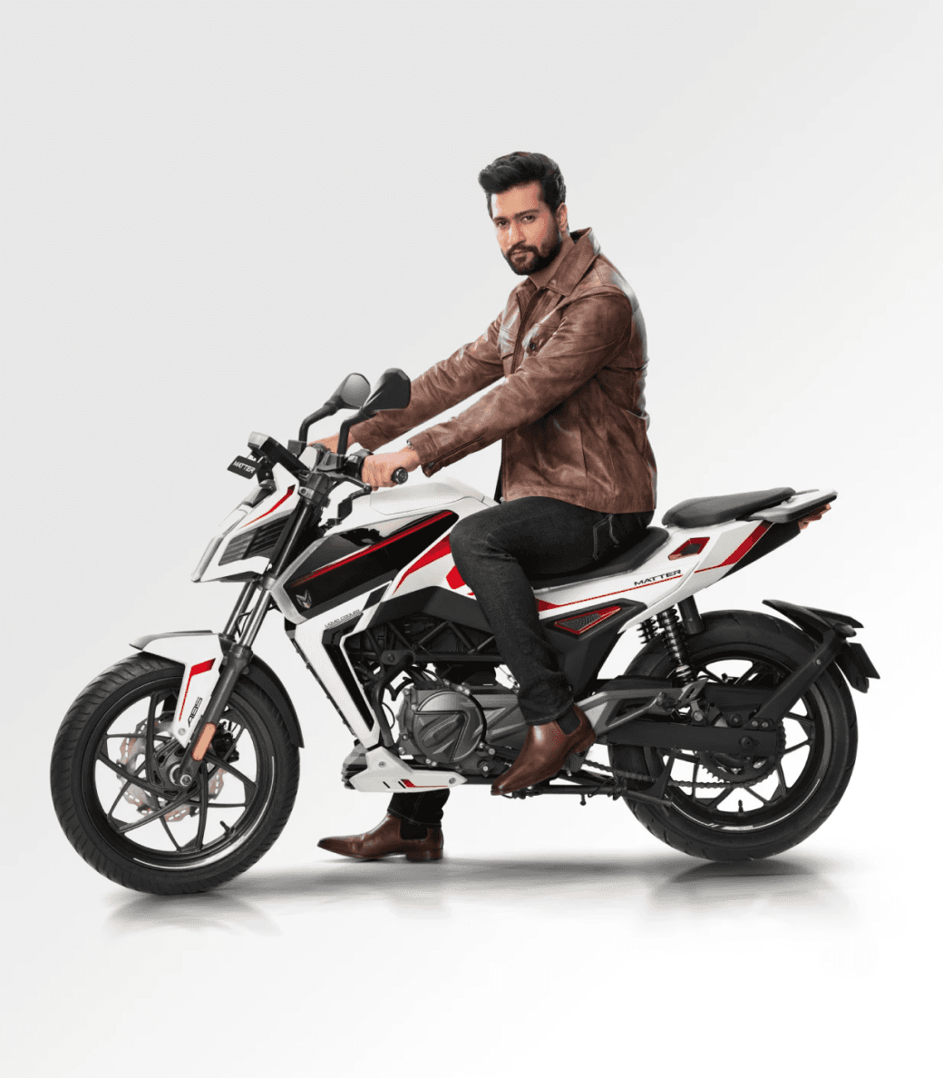
Matter motors
OCT 2020 - MAY 2021
India’s first liquid cooled motor and geared electric 2 wheeler company based in Ahmedabad, India. gave me the first opportunity to design a user interface for their upcoming Matter Aera 5000 electric vehicle
Role
User Interface Designer
Responsibilities
User interface design
Research
Team
Jr. UI Designer (Myself)
Sr. UI Designer
8 Months duration
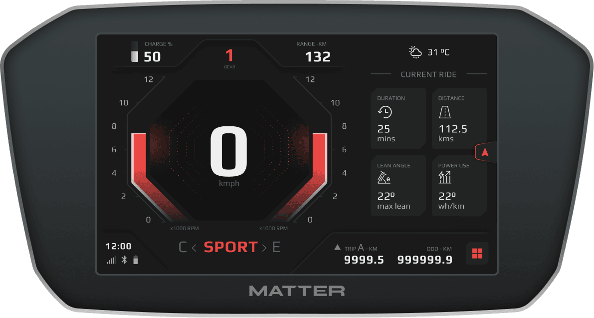
User interface design for VIU (Vehicle intelligence unit) / speedometer
A mobile application to connect with the vehicle for additional informations
About my first ever live project 🏆
How did we choose the font size 🖋️
30cm - 50cm
Viewing distance
(Commuter/cruiser)
To determine the right font size, we need to consider several factors such as the viewing distance from the rider's sitting posture on a motorbike, the impact of sun-glare, and the importance of the information while the rider is actively riding.
Approach to designing an interface for E-bike! 🏍️
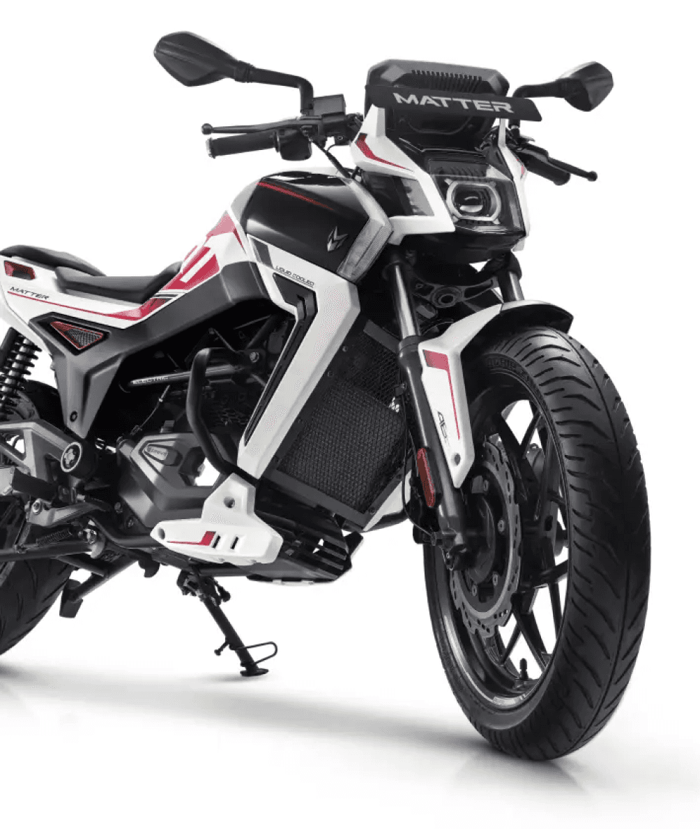
Designing the user interface for an E-bike with a 7-inch TFT display was my first UI project, presenting a unique challenge. Unlike conventional mobile apps or websites, automotive UI design requires starting from scratch, as there isn't a general design system in place.
Variables we have to consider 🧐
Weather
Position of the device on the vehicle
Color blindness
Vast demography
Information
Compatibility with manual control unit
Weather 🌦️
The font visibility to the rider while riding the bike under bright sun is a crucial consideration
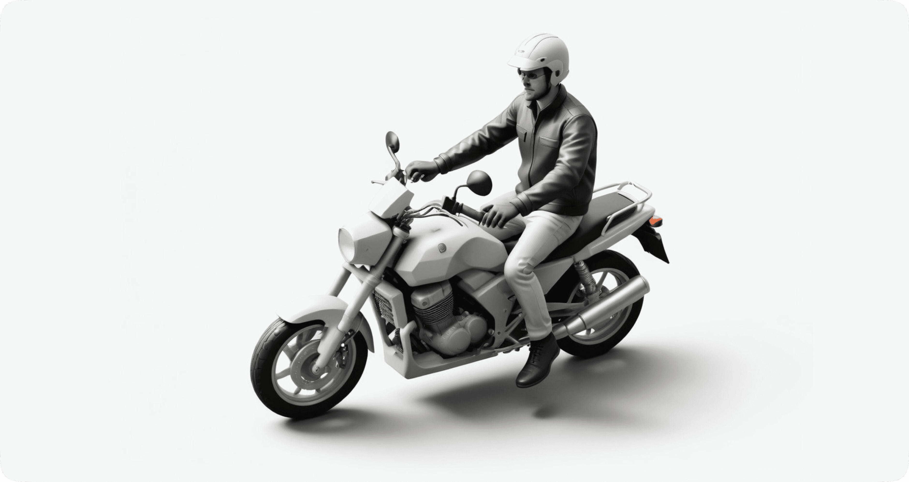
We created a rig mirroring the sitting posture of our final physical product and gathered approximately 100 individuals of varying heights, considering their torso-to-lower-limb ratio.
We included a diverse range of users with visual challenges, including those with normal sight, color blindness, and photosensitive seizure sensitivity.
Sun 🌞
Considering the usability of the touch device under rain is a critical factor to take into account.
We developed a range of interactions for the interface and tested them under artificial rain conditions to evaluate the device's compatibility.
Rain ⛈️
Considering the usability of the touch device under low light conditions
We considered designing a dark mode style for the device, particularly useful during nighttime.
It's essential to ensure that crucial information remains visible to riders at the right times, even in low-light conditions.
Night 🌚
Touch area👇🏻
With riding gloves 🥊
100p x 100p
Without riding gloves
72p x 72p
Without riding gloves
D100
While mobile devices and websites typically focus on touch target area sizes, with the thumb being the most common finger used, automotive devices primarily communicate through the pointer finger, with the middle finger, ring finger and pinky finger being used in rare cases.
Style guide 🖌️
Taking into account all the factors absorbed during our research, we balanced the decision between user needs and business propositions.
Colors in UI design have a profound impact, speaking as powerfully as copy. They not only influence the appearance of your design but can evoke emotion and convey your brand's personality. Colors also shape the overall "look & feel" of your designs, serving as the initial impression on users. Although color perception can vary, it's evident that well-chosen colors can attract and convert users. Keeping in mind that all color codes follow "Indian Homologation Rules".
Getting the colors right 🎨
The choice of green for "Economy mode" in a two-wheeler is to convey the message of efficiency, conservation, and environmental friendliness, while also ensuring visibility and clarity for the rider.
Economy mode 🍀
The choice of blue for "City Mode" in a two-wheeler is to convey a sense of connection to urban environments, calmness, and stability, while also ensuring visibility and contrast for easy identification by riders.
City mode 🌇
The choice of red for "Sport Mode" in a two-wheeler aims to convey a sense of energy, intensity, and high performance, while also ensuring clear differentiation and easy identification for riders seeking a more dynamic riding experience.
Sport mode 🔥
Dark grey is a neutral color and is the foundation of the color system. Almost everything in UI design — text, form fields, backgrounds,
Background colors
#131313
#FEFEFE
#1A1A1A
#F3F3F3
#232323
#C9C9CB
The primary colors reflect the bike's ride modes: green for economy mode, blue for city mode, and red for sports mode.
Primary colors
#36C465
#3376FF
#ED4A41
Dark grey is a neutral color and is the foundation of the color system. Almost everything in UI design — text, form fields, backgrounds,
Text colors
#EFEFEF
#EFEFEF
#7D7D7D
#5E5E5E
#494C4C
#1A1A1A
How did we choose the font? 🖌️
Typography
We based our typography on the theme of our bike design, which features sharp-edged parts and a futuristic design associated with octagon shapes. Our research focused on finding fonts that are both futuristic and legible.
Play Bold - 52px
H1
Play Bold - 48px
H2
Play Bold - 38px
H3
Play Bold - 38px
H4
Play Bold - 26px
B1
Play
Play
Primary typeface
Economy mode
Eco-friendly mode has green accents

City mode
City mode has blue accents

Sports mode
Sports mode has red accents
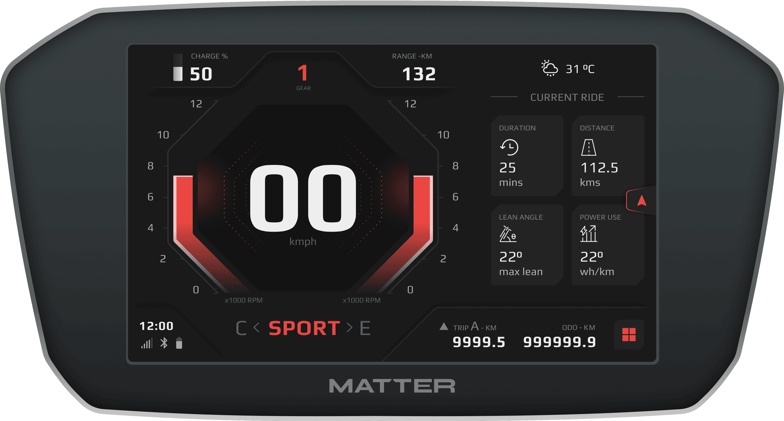
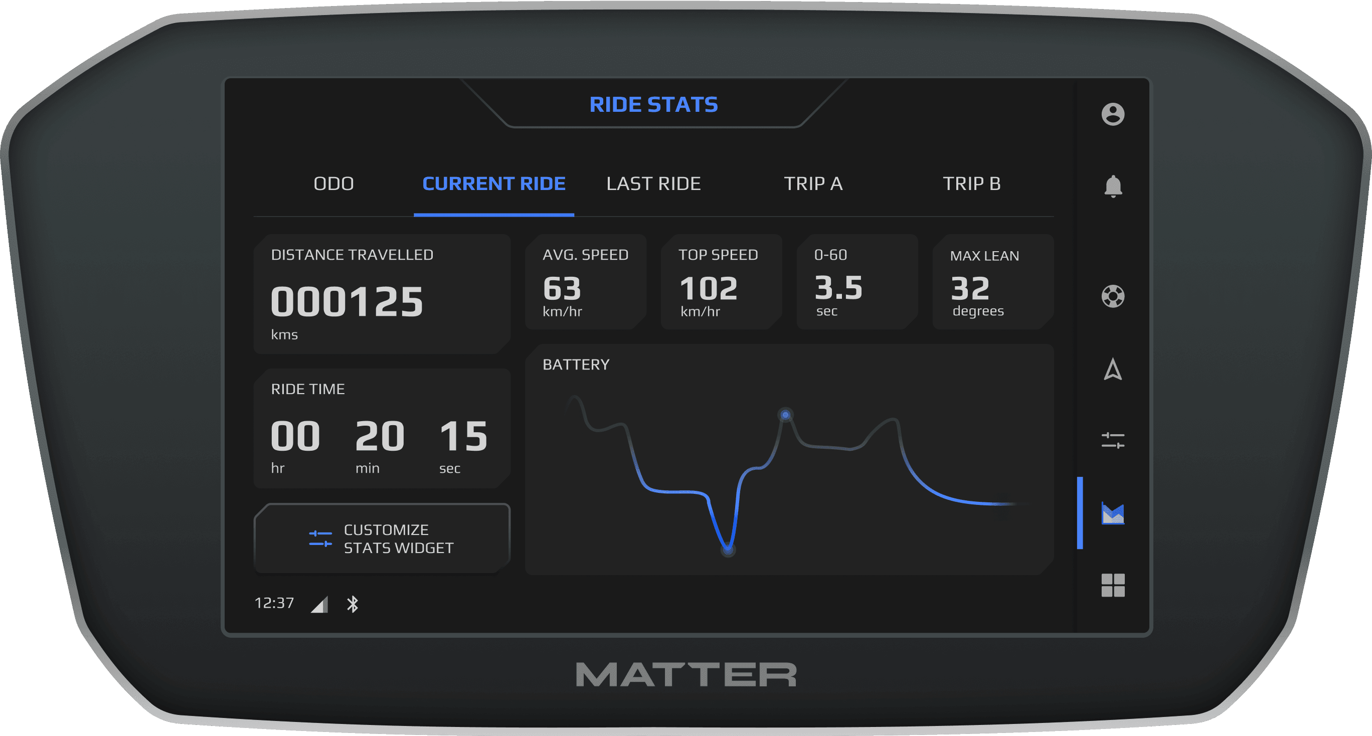
Ride statistics
A detailed statistics of every ride, from point A - B
Design hand-off
Marking all the touch target areas

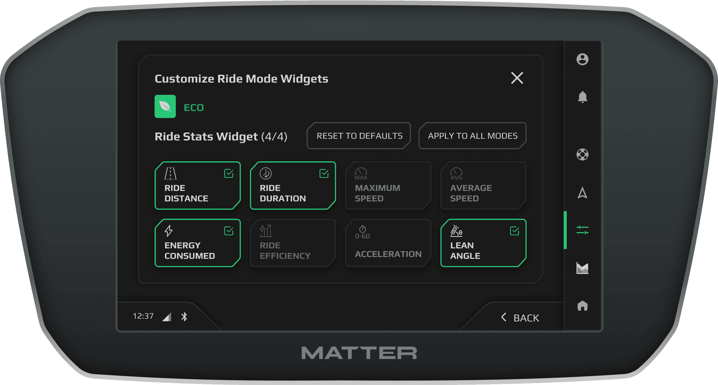
Widget selection
Custom widget settings to show in main screen
Matter Aera 5000
Interactive interface for premium feel

Automotive reviewers loved the design 🥰


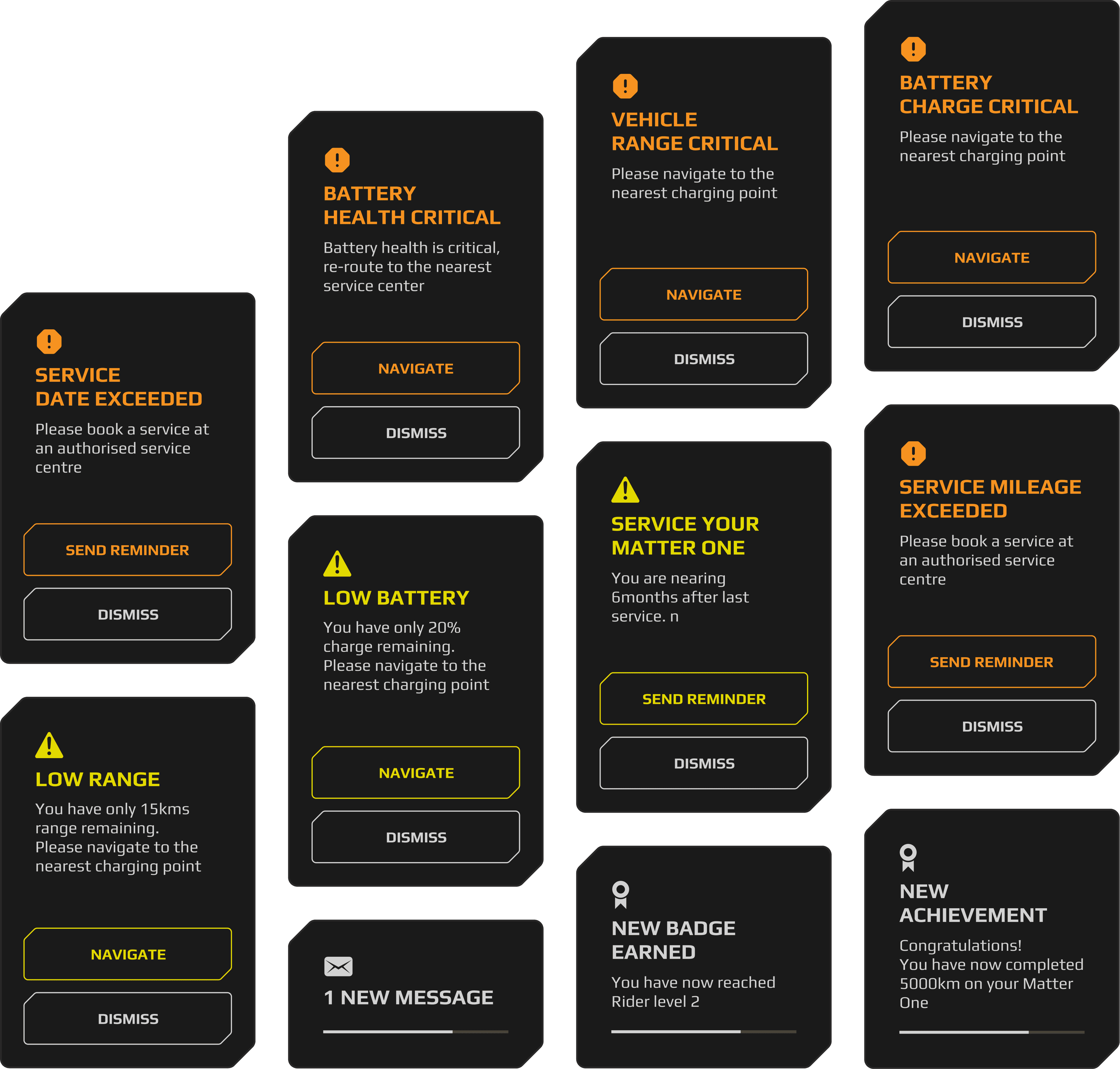
Alerts🚨, cautions⚠️ & notifications🔔
Final design UI
UI-Design
The basics of user interface and user experience principals
Color theory, creating a moodboard
Grids, layouts & spacings
How tech is related to design
This project taught me
Personal take aways from this project 🤠