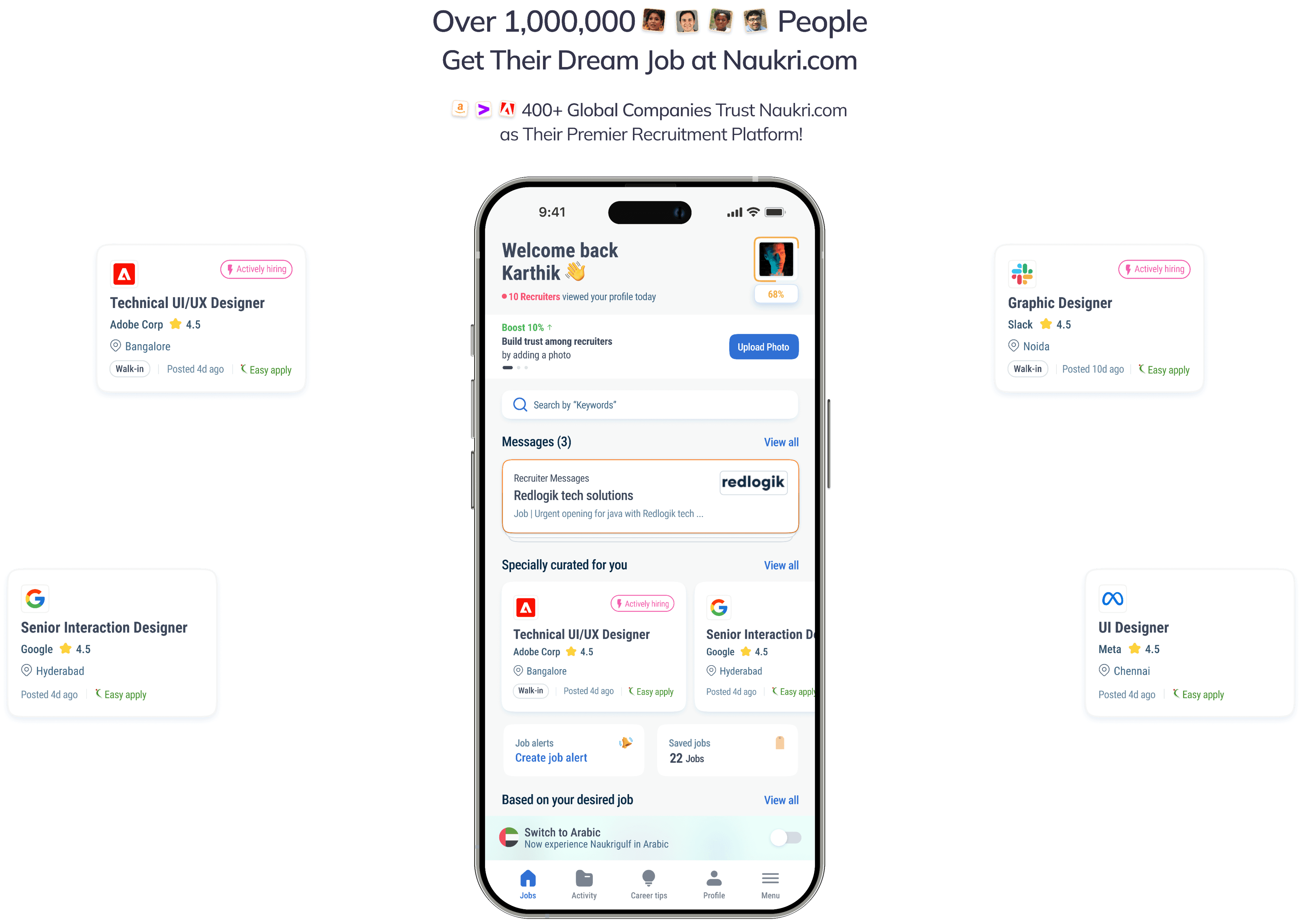
Infoedge (Naukrigulf.com)
AUG 2022 - DEC 2022
Job Discovery Enrichment
Naukrigulf.com, a top online job search platform, noticed that job seekers and employers had changing needs in the ever-evolving world of recruitment. Despite many new job titles and people relying more on online platforms for job hunting since the 2000s, the user experience stayed pretty much the same. Realizing how vital it is to listen to user feedback, both from job seekers and recruiters, Naukrigulf.com set out to transform the industry by creating a next-level job search platform.
34%
Increased activity in browse behaviour
28%
Increased activity in browse behaviour applies
22%
Increased activity in browse behaviour (grey collar profiles)
11%
Increased satisfaction for the users
Role
User experience designer
Responsibilities
System design
User interface design
Research
Team
Designer (Myself)
Product manager
Engineer
Data analytics
5 Months duration
10M+
Downloads
#69
Business ranking
4.3
138k reviews
4.6
41.2k reviews
Our goal was to enhance usability, efficiency, and satisfaction for all stakeholders involved, ultimately setting a new standard for recruitment platforms.
Our Goal 🎯
Key metric
Overall job applications and applicants should increase by at
least 20%.
Achieve a 30% increase in the quality of applications for recruiters.
Implement strategies to re-engage users on the platform.
What we have to achieve? 🏆
What it takes to build an outstanding product? 🤔
Qualitative research, quantitative research, data analysis
Let’s ask the users 🕵🏻
To tackle the platform's issues, our team started thorough research to pinpoint user challenges. Two of our product managers interviewed more than 950 active Naukrigulf.com users in the United Arab Emirates, with me supporting remotely. One significant finding was the absence of job title grouping on the site. To improve user experience and streamline future data analysis, we suggested a solution, categorising jobs into "Blue collar, white collar, grey collar" distinctions. This approach aims to make the user experience easier while offering useful data segmentation for future enhancements.
(User Interviews, Google form surveys, Linked in polls, In-app surveys, Mailer feedbacks)
950+
Total active users
300+
Blue collar profiles
300+
White collar profiles
300+
Grey collar profiles
Questions
Starting with open ended question and directing users to close ended questions
How is the overall experience using Naukrigulf.com?
How is the onboarding process?
What other activities do users engage in aside from applying/searching for jobs?
Do they receive calls from recruiters? (Profiles with 50% - 100% completion)
How well do users set up their profiles?
What are the common issues users are facing?
Are users applying to jobs from our suggested jobs?
Do users feel the job postings are relevant to them?
How frequently do users visit Naukrigulf compared to competitors?
#Job Application Process
#Job Relevance
#Platform Usage
#Recruiter Interaction
#Profile Setup
#Onboarding Experience
What we found out? 👁️🗨️
Job seekers who already registered seldom remember Recommended jobs and Jobs from Alerts
Others were pleased when we helped them discover the jobs
Additionally, they're happy about Similar jobs on JD pages but they did not discover these similar jobs by themselves, particularly on mobile devices
A major learning here is that users are seeking the system to read their profiles and recommend personalised and relevant jobs in addition to traditional browse and search routes employer searches
Job discovery
82%
Very few job seekers were aware of WHTMA and WHTMCV updates in the Activity tab. All jobseekers were glad about the information available on this tab after we informed them
Activity discovery
95%
😩
Grey collar job seekers finding difficulty in completing their profiles (CV) (Usability issues)
Profile setup
98%
😩
Visa status - First ask if that candidate is a citizen (Emirati/Saudi etc.). If he selected no, then we show different types of Visa statuses. If he selected yes, there is no requirement to show the types of Visa status
Profile Headline - Many JS, mostly freshers, were confused about what to write in the profile headline and profile summary.
Keyskills and IT Skills/Certifications - JS needed education about writing all their corresponding skills so that they are visible to the recruiters in their searches
Job seeker needed education about updating profile details so that they are found relevant through employer searches
Profile improvement suggestions
17%
😍
73%
Job seekers wanted shorter registration forms on Mobile as they want to view and apply to jobs asap
Lengthy registration form
Job seekers particularly freshers, were extremely interested in CV writing services
Resume writing services
66%
Job seekers forgot that they downloaded the app/registered with us earlier
Lower brand recall
24%
Career Tips was not discoverable by users until we told them to refer to this section
Content discovery
😩
92%
Job seekers does not use the apps after finding a new job
As a result of all of the above points, some JS downloaded the app earlier but they've uninstalled it as they did not find it useful/helpful for their job search
App uninstall
12%
Major findings from all forms of survey
Lets’s compare the feedback with data 🕵🏻
During our qualitative research, we realized the importance of pairing it with quantitative data analysis. Recognizing that design solutions shouldn't rely solely on verbal feedback, we dug into data analysis to find connections between user feedback and actual usage patterns. As designers, using data to guide our decisions is crucial. We started by mapping out all job touch-points to get a complete picture of the user journey.
(Information architecture mapping, data analysis)
Desktop-Website and Mobile-site follows same information architecture and the Android and IOS applications follows the same information architecture
Platforms we cover
D-Website

M-Site
Android
IOS
Mapping the “Job” touch points - Website
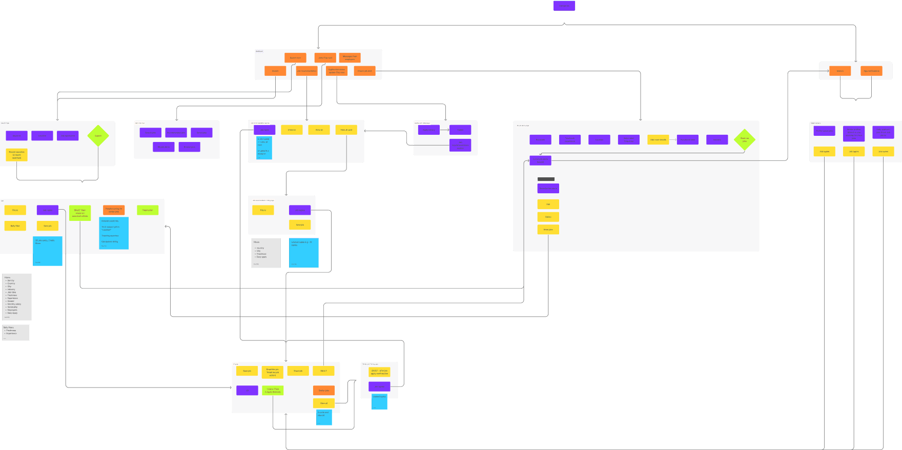
Includes all the touch-points
Mapping the “Job” touch points - Mobile application

Includes all the touch-points
Aiming to collect every data which is available 💯
Once we mapped out the job touch-points, we discovered several potential user journeys. To ensure thorough tracking, we set up trackers for 90% of the action points. We shared these specifications with the product manager, who needed about a week to collect the required data.
No. of alerts create per user
Number of taps on “View jobs” link on saved alerts
Ratio of Job tuples from listing page to JD, JD to apply
Job alerts
Search page
Fill rate of “Keyword field”, “ Location field”, “Job experience”, Combine ratio of (1, 1-2. 1-2-3)
Mailers
Open rate of job alert mailers - mailer opening to platform ratio
SRP
Ratio of SRP opening to clicks on “Filter”
Ratio b/w usage of all Filter attributes
Number of taps on “Save job” Icon on Job tuple
Number of taps on “SSA” toggle
Jobs page
Number of taps on Search field
Ratio b/w Search field taps to JD, JD to apply
Number of taps on Recent searches
Number of taps on Job tuples in “Job recommendation” section
Ratio between taps on Job tuples within “Job recommendation” section to JD, JD to apply
Number of taps on “View all” link and “View all” card (Job recommendation)
Ratio of job tuples to JD, JD to apply within “Job recommendation, view all listing page”
Number of taps on Job tuples in “jobs from alerts” section
Ratio between taps on Job tuples within “jobs from alerts” section to JD, JD to apply
Number of taps on “View all” link and “View all” card(Job alerts)
Ratio of job tuples to JD, JD to apply within “jobs from alerts, view all listing page”
Ratio between taps on Job tuples within “Saved by you” section to JD, JD to apply
Number of taps on “Top employers on NG” section
Number of taps on “View all” link and “View all” card(Job alerts)
Ratio of job tuples to JD, JD to apply within “Top employers, view all listing page”
Ratio b/w taps on “Apply CTA top” vs “Apply CTA bottom”
Number of taps on “Share job”
Number of clicks on “SMJLT”
Number of taps on “Similar jobs” section job tuples
Number of taps on “Save icon” on job tuple
JD page
Number of clicks on Job tuples within “Job recommendation” section (“Ratio” - Tuple to JD, JD to Apply)
Number of clicks on “View all” Ghost button and clicks on “View all” card within the section
Applied job detail page
Fill ratio of each fields
Number of clicks on “Send me jobs”
My job alerts page
Number of clicks on “Edit”
Number of clicks on “Delete”
Number of clicks on “More jobs”
Active job alerts section
Number of clicks on Job tuple
Dashboard
Job recommendation section
Number of clicks on Job tuples within “Job recommendation” section (“Ratio” - Tuple to JD, JD to Apply)
Number of clicks on “View all” link and clicks on “View all” card within the section
Search page
Fill rate of “Keyword field”, “ Location field”, “Job experience”, Combine ratio of (1, 1-2. 1-2-3)
Number of clicks on “Search” button
Number of clicks on “Recent searches”
Job recommendation listing page
Number of clicks on Job tuples within Job recommendation listing page (“Ratio” - Tuple to JD, JD to Apply)
Click ratio of each filter attributes (Job recommendation listing page”
Number of clicks on “Save job” icon on job tuple
JD page
Ratio between opening JD page and Save job
Ratio between opening JD page and “Email me job” action
Ratio between opening JD page and Share job
Ratio between opening JD page and clicks on SMJLT
Ratio between opening JD page and clicks on Similar jobs “Job tuple”
Ratio between opening JD page and “Similar jobs” - View all button
Ratio between Apply button (Top) and apply button (Bottom)
Jobs (Top nav)
-Click ratio between all features
Number of clicks on Search field
Number of clicks on Search icon in top nav bar
Number of clicks on “Jobs” tab on top nav
Number of clicks on “Create job alert”
Dashboard
Number of clicks on notification
App notification
SRP
Click ratio of attributes within filters
Ratio of SRP opening to clicks on “Filter”
Ratio of SRP opening to clicks on “Belly filter”
Number of clicks on “Save job” Icon on Job tuple
Number of clicks on “SSA”
Number of clicks on Job tuples on each page, from 1st page till ? (“Ratio” - Tuple to JD, JD to Apply)
Number of clicks on Pagenation (Ratio of Page 1 , Page 2, Page 3..)

Job description page performance
To understand platform level conversion rate between viewing JD page and applying through it
Job description page performance
To understand job category level conversion rate between viewing JD page and applying through it

Job category performance
To understand which job category performs best in each platform

Apply button performance
To understand whether users are genuinely reviewing the job description before applying for the position

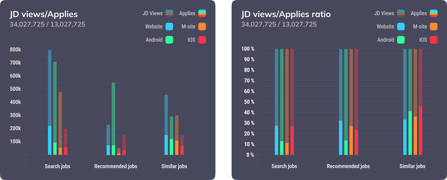
We got some insights 🔍
The website platform exhibits higher engagement across all job categories.
Most of the users were not aware of WHTMA and WHTMCV
Search behaviour is superior on the website, whereas browse behaviour excels across all platforms, particularly in the conversion of similar jobs with the most job description views to applications.
Users expressed delight upon discovering the relevance of similar jobs and the career page.
IOS users demonstrate a commendable profile completion rate and a superior job description view-to-apply ratio.
Upon applying for a job from search results or recommended listings, users are directed to a page featuring similar jobs, where they discover more relevant opportunities and engage in a loop within similar job categories. (Supporting data: Similar jobs boast the highest conversion rate in terms of job description views to applications.)
User feedback from interviews conducted by the product management team indicates a lack of awareness regarding recommended and similar jobs. Users tend to apply from job categories without necessarily recognising the category title.
Grey collar profiles encounter challenges in completing their profiles, with their profiles consistently falling short of achieving 100% completion due to the absence of IT skills or certifications requirement.
Immigrants are actively seeking comprehensive visa-related information.
Freshers are interested in resume writing services.
Implementing profile personalisation will enhance the platform's value proposition. However, sub-categorising blue-collar, white-collar, and grey-collar jobs will necessitate extensive research and meticulous data structuring.
This project resulted in a 12-month roadmap for the company.
Let’s compare the user feedback with data ⚖️
Comparing the user interview research with data validates our assumptions
Understanding and uncovering the myth
Absolute user journey 🛫
Using the data provided, the actual user journey has been derived
Search
SRP screen
Filters
JD page
Apply
Similar jobs
Recommended jobs
Similar jobs
Users were unaware of our job recommendation categories but still ended up applying from those job categories. How?
“Search” category has more engagement but less performance. Why?
Confusions 🤷🏻
Understandings 🧐
The current homepage UI design has more attraction to the search bar due to its bright-colored visuals, which attracts the user to search instead of browse
The placement of the search bar on the home page influences the prominence of both the recommended jobs section and the sections below it, respectively.

Onboarding data collection - (Freshers)
Only data which are helpful to show jobs after registration
Education details
Key skills
Personal details - Current location, nationality, gender
Mandatory
Language (To show jobs based on languages in a region)
Optional
Onboarding data collection - (Experienced)
Only data which are helpful to show jobs after registration
Education details
Professional details - Total EXP year, current designation, current employer name, monthly salary
Key skills
Personal details - Current location, nationality, gender
Mandatory
Language (To show jobs based on languages in a region)
Optional
Current Homepage
Final design UI
UI-Design
Immediately after onboarding, we display job recommendations based on the data acquired during the user onboarding process.
Introducing personalised job recommendation categories
Jobs hand-picked
just for you
Get recommendations matching
your profile

Crucial information in your hand
Recruiter messages, views on profile / application
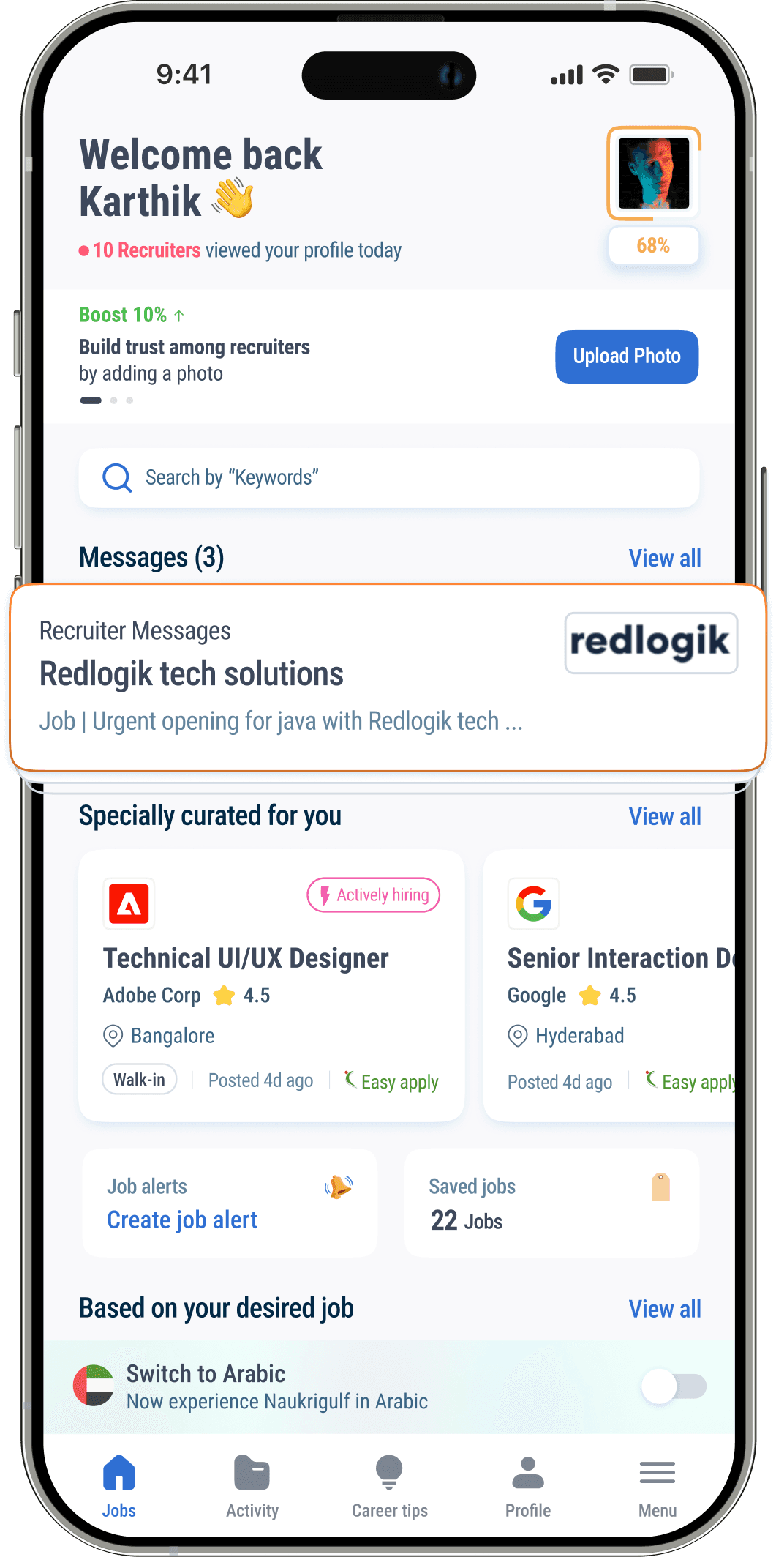
As a company, it's essential to educate users on how they can enhance their visibility to recruiters and discover their dream job
Educating users about WHTMA and WHTMCV
Dedicated activity section
Track your application status
Who viewed your profile?
Know how your profile / application performs
Insights on your job application with peer rankings
Get to know employer actions on your profile


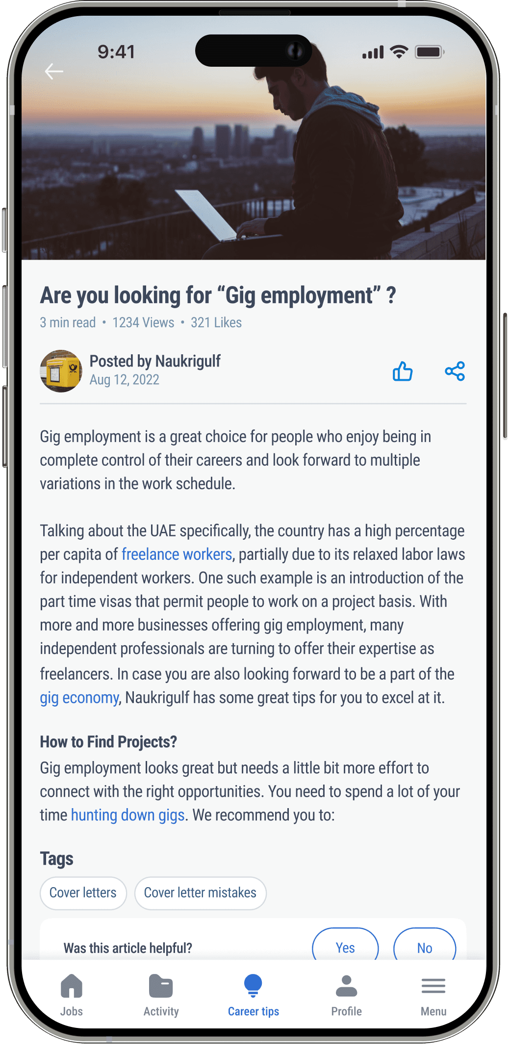
Dedicated career tips for users
Personalised tech news feeds
Articles to improve your career
News feed within Emirates region updates by Emirates - WAM
Based on your industry, key skills and the desired jobs
An article per week tailored by Naukrigulf experts
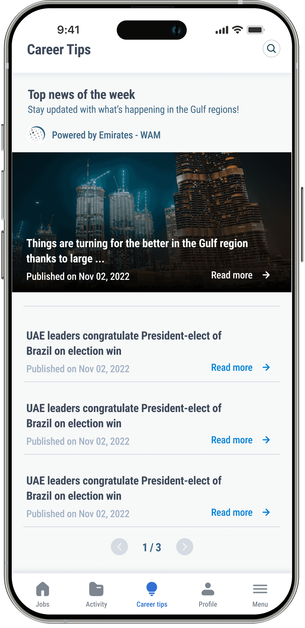

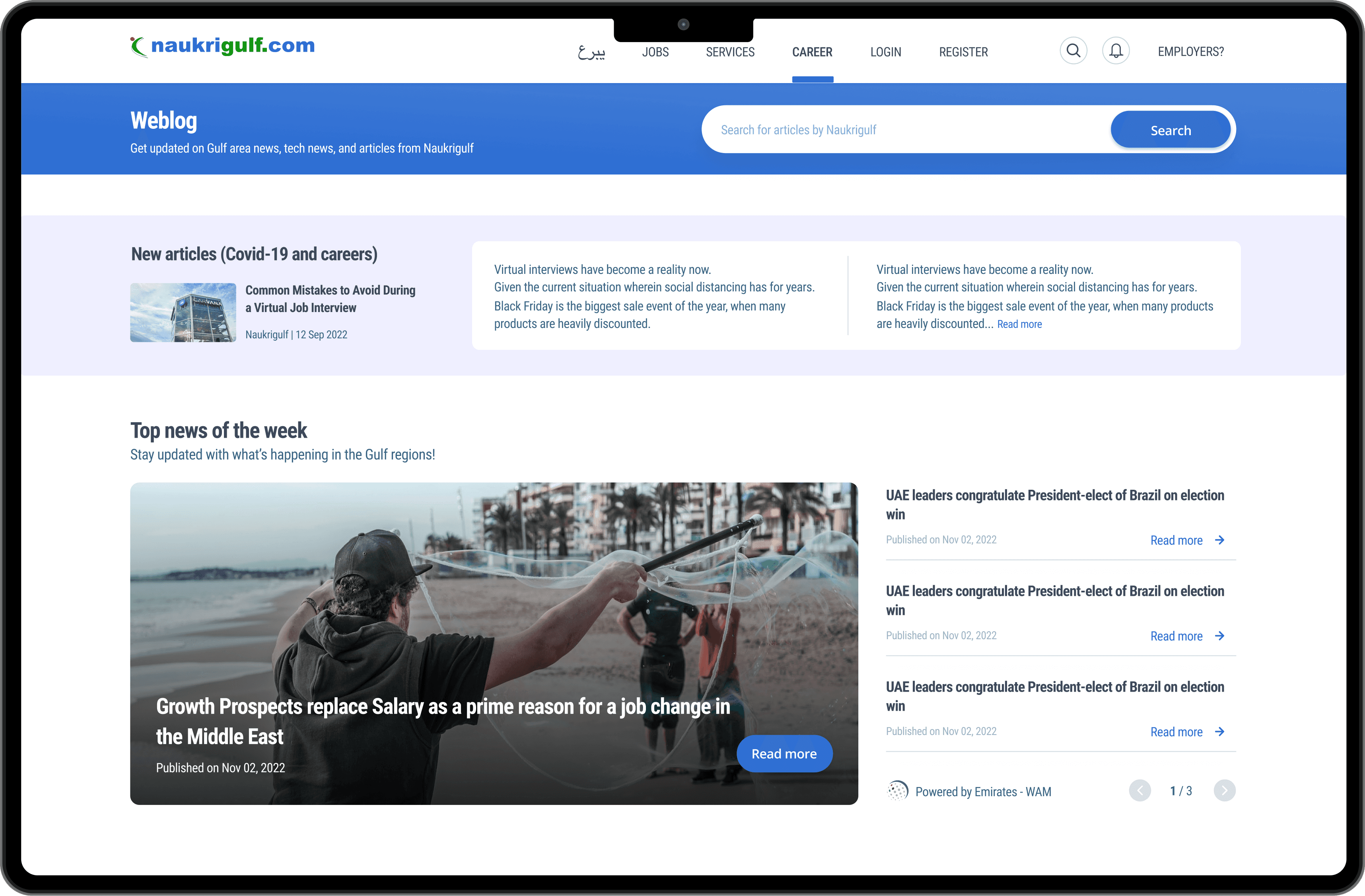
Career page
Introducing a new career page personalised for users industry, functional area, and desired job
1 article per week or 3 articles per month (new articles will be highlighted)
News feeds relevant to individuals exploring jobs and VISA in the Emirates region - updated daily
Tech mini-feeds refreshed every 2-3 days based on user profile (functional area), with generic articles for logged-out users
Profile section in detail
Now know the value of maintaining your profile

Document your promotion
Show your career progress to recruiters

As a company, it's essential to educate users on how they can enhance their visibility to recruiters and discover their dream job
Educating users about profile completion and promotion

Instead of the "Onboarding project," which might take a considerable amount of time to implement, we have chosen to educate customers through mailers and focus on retaining users on our platform.
Mailer design 📬
What we achieved in 2 months 🎯 ?
After collaborating closely with developers to actualise the designs, we launched the test and held our breath
From the project's outset, we identified two primary indicators of success, increased engagement and enhanced satisfaction
Thankfully, our users found the experience more captivating and gratifying than ever before
We observed a remarkable increase in clicks on Suggested Jobs by 34%, applications by 28%, and grey collar profile users engaging with Suggested Jobs by 22% Additionally, satisfaction levels rose by 11%
This substantial win not only warranted rolling out the designs to all of our web users but also paved the way for our team to explore new groups, establish a system for group ordering, and extend the designs to iOS and Android platforms
Data compared over 2 months after implementation
What we learned from this project ! 🏆
By heeding our user’s feedback and implementing changes that brought tangible value to them, we developed a dynamic Suggested Jobs page with significantly enhanced testing capabilities. Throughout this journey, I experienced personal growth as a designer and gleaned several key insights:
1. Comparing user feedback with data holds inherent value: Even when the existence of a problem is apparent from user interview, data analysis can offer invaluable insights into nuances and helps us to make a solid decisions.
2. Pursuing low-hanging fruit yields substantial rewards: Initially, I underestimated the significance of the problem, assuming it was too obvious for others not to have addressed it already. However, persisting with the project revealed its considerable magnitude and potential.
3. Embracing a systems mindset fosters flexibility: While seemingly simple, our transformation to grouped rows exemplified the power of systems thinking. By applying this approach at various levels (groups, headers, menus), we devised a solution that enabled our product management team to conduct extensive testing of hypotheses on a large scale while optimising efficiency for our engineering and design teams.
To validate my assumptions and give a solid data driven design solution
To analyse data and understand the business through a designers perspective
To reach out user in person for better understanding
To collaborate with different teams and stakeholders
To initiate and lead a research project
This project taught me
Personal take aways from this project 🤠
Let’s convert numbers into skyscrapers 🗼
To understand better, all the data were converted into graphs

“”I chose "Job applies" as the top priority in hierarchy because it directly aligns with the intentions of all our users. Ultimately, every user's goal is to find and apply for a job that perfectly fits their needs and aspirations. Therefore, when a user successfully applies for a job through our portal, it confirms that our product has fulfilled their intention and desire, marking a significant achievement for us.””